kim.sunghoon
Creative Director
Creative Consultant
Graphic Designer
/
SIMPLE, CLEAR, HARMONY, BALANCE >>> MAKE A RULE.
/
| Creative Directing, Creative Consulting | Brand Design, Graphic Design, Book Design, Information Design, Exhibition Design, Space Design, Signage Design, & etc. Design
hoons79@gmail.com | +82.(0)10.2541.8550 | hej.kr | instagram | behance |
/about kim sunghoon
Awards
Brand Design Studio hej ︎︎︎
2025
︎579th Birthday of Hangeul (Poster) ︎Laurent Grasso: MEMORIES OF THE FUTURE (Leaflet)
︎Laurent Grasso: MEMORIES OF THE FUTURE (Poster)
︎Laurent Grasso: MEMORIES OF THE FUTURE (Exhibition Graphic Design) ︎Laurent Grasso: MEMORIES OF THE FUTURE (Exhibition Title)
︎ttSeoul (Application)
︎ttSeoul (Identity System)
︎ETERNO, ETERNO APGUJEONG (Brand Book)
︎ETERNO APGUJEONG (Brand Book)
︎ETERNO APGUJEONG (Brochure)
︎ETERNO APGUJEONG (Super Graphic)
︎Hello Sans (Korean Fonts)
︎Honey SaSha (Branding)
︎ETERNO (Brand Book)
︎happy new year 2025
2024
︎MEMORY (Book)
︎ETERNO (Brand Fonts)
︎ETERNO (Architectural philosophy)
︎ETERNO (Brand Philosophy)
︎ETERNO (Brand Identity)
︎578th Birthday of Hangeul (Poster)
︎Markus Lüpertz: Sins, Myths and Other Questions (Book)
︎Markus Lüpertz: Sins, Myths and Other Questions (Leaflet)
︎LEIKO IKEMURA: Light on the Horizon (Book)
︎LEIKO IKEMURA: Light on the Horizon (Poster)
︎ETERNO CHEONGDAM Sign System (Signage)
2023
︎577th Birthday of Hangeul (Poster)
︎Rising Exclamation Mark (Font)
︎Anselm Kiefer: HERBST (Exhibition Poster)
︎Anselm Kiefer: HERBST (Exhibition Book)
︎Anselm Kiefer: HERBST(Exhibition Design)
︎Lee Jeong-gi, a pilgrim who follows the sound (Book)
︎Korean Photography Inside Out, 1929-1982 (Photo Book)
︎Korean Photography Inside Out, 1929-1982 (Photo Book)
2022
︎Korean Photography Inside Out, 1929-1982 (Exhibition Poster)
︎MUSEUM HANMI SAMCHEONG (Book)
︎20 YEARS OF THE MUSEUM OF PHOTOGRAPHY, SEOUL (Book)
︎LAPENTHILL (Brand Book)
︎A New Encounter, Immersive Gallery of Korean Art (Exhibition Leaflet)
︎A New Encounter, Immersive Gallery of Korean Art (Exhibition Graphic)
︎A New Encounter, Immersive Gallery of Korean Art (Exhibition Poster)
︎a Vibrating Bird (Poster)
︎LAPENTHILL (Billboard)
︎LAPENTHILL (Application 2)
︎LAPENTHILL (Application 1)
︎LAPENTHILL (Branding)
︎576th Birthday of Hangeul (Poster)
︎LUXIA (Brand Book)
︎Honey SaSha (Brand Movie)
︎Honey SaSha (Branding)
︎LUXIA (Billboard)
︎LUXIA (Brand Book)
︎LUXIA (Letter of Invitation)
︎LUXIA (Brand Movie)
︎LUXIA (Branding)
︎hej (Branding)
2021
︎MOMENT BY MOMENT, WE SAY ‘NO CONCEPT BUT GOOD SENSE’ (Brand Book)
︎87MM ILSANG FONT FAMILY (Font)
︎THE A.TION (Application)
︎THE A.TION (Branding)
︎Happy New Year 2022 (Poster)
︎2022 Calendar_hej (Calendar)
︎About Romance (Poster)
︎575th Birthday of Hangeul (Poster)
︎575th Birthday of Hangeul (Poster)
︎575th Birthday of Hangeul (Poster)
︎ETERNO CHEONGDAM (Brand Book)
︎ETERNO CHEONGDAM (Brand Book)
︎ETERNO CHEONGDAM (Brand Customize Book_Double)
︎ETERNO CHEONGDAM (Brand Customize Book_Single)
︎ETERNO CHEONGDAM (Brand Application)
︎K ONE (Branding)
︎korecipe (Package)
︎korecipe (Branding)
︎2020 Kakao’s Commitment and Responsibility (ESG report)
︎KCC (Brochure)
︎ETERNO CHEONGDAM (Billboard)
︎ETERNO CHEONGDAM (Billboard)
︎WEMADE shift (Mask & Strap set)
︎buddyBUDDY (Branding)
︎hej Branding (Goods)
2020
︎GumNanse Music Center (Branding)
︎Feel the Real Korean Heritage (Goods)
︎Feel the Real Korean Heritage (Poster)
︎Feel the Real Korean Heritage (Guide Book)
︎Feel the Real Korean Heritage (Leaflet)
︎Feel the Real Korean Heritage (Map)
︎‘Visit Korean Heritage’ Campaign
︎Feel the Real Korean Heritage (Branding)
︎Stardust, Black & White (Poster)
︎SHIFT (WEMADE Brand Extension)
︎WEMADE, SHIFT (Mask Kit)
︎574th Birthday of Hangeul (Poster)
︎Korean Society of Typography,
typography calendar 2021 (Calendar)
︎Seowon, Korean Neo-Confucian Academies – A World Heritage (Signage)
︎The Journey of Arita (Book)
︎Dokkaebi (Book)
︎BIG-GAME: EVERYDAY OBJECTS (Book)
︎Kang Yoon Sung, Graphic Design Story (Book)
︎Beautiful Building in the City 2020 Calendar (Calendar)
︎Happy New Year 2020 (Poster)
2019
︎Currency War (Poster)
︎Exhibition of 100 Years of Democracy in Korea (Book)
︎Exhibition of 100 Years of Democracy in Korea (Exhibition)
︎Exhibition of 100 Years of Democracy in Korea (Poster)
︎March 1st Independence Movement and Establishment of Provisional Government of Korea (Poster)
︎Gwangju Design Biennale 2019 (Exhibition Book)
︎573th Birthday of Hangeul (Poster)
︎Junglim Architecture (Branding)
︎Bauhaus Dessau, 100 Years of Bauhaus (Poster)
︎March First Independence Movement (in 1919, against the Japaness colonial rule) (Poster)
︎VAMOS (Eco Bag)
2018
︎WEMADE (Branding)
︎WEMADE (Brand Renewal Story)
︎WEMADE (Brand Movie Part 3)
︎WEMADE (Brand Movie Part 2)
︎WEMADE (Brand Movie Part 1)
︎Happy New Year 2019 (Poster)
︎Beautiful Building in the City 2019 Calendar (Calendar)
︎G-Star 2018, Busan (Brand Movie)
︎G Star 2018, Busan (Exhibition)
︎572th Birthday of Hangeul (Poster)
︎wecampaign (Branding)
︎democracy (Poster)
︎Museom Maeul (Book)
︎Seonbi Sesang (Book)
︎Sunbatang (Poster)
︎Happy New Year 2018 (Poster)
2017
︎Josef Koudelka (Photo Book)
︎Y (Poster)
︎Beautiful Building in the City project 2018 (Calendar)
︎Good-Bye 2017 (Poster)
︎Merry Christmas (Poster)
︎Yoondesign (Poster)
︎Yoondesign (Signage)
︎Yoondesign (Branding Application)
︎Yoondesign (Brand Movie)
︎Yoondesign (Branding)
︎SEOUL 1392-2017 (Poster)
︎SEOUL (Identity)
︎Hangeul, 14 Consonant Letter (Poster)
︎571st Birthday of Hangeul (Poster)
︎DPPA, Start Again (Poster)
︎LOTTE DUTY FREE (Poster)
︎Spring Flowers (Poster)
︎Generation Conflict (Poster)
︎NO THAAD (Poster)
︎Beautiful Building (Identity)
︎Rufer House (Poster)
2016
︎570th Birthday of Hangeul (Poster)
︎Hangeul (Identity)
︎Villa Müller (Poster)
︎Le Moulin (Poster)
︎Pyeongchang 2018 (Leaflet)
2015
︎Made in Korea: Chung Ju-yung and the Rise of Hyundai (Book)
︎Charlies Country (Poster)
︎HDC Masterpiece 2014-2015 (Brochure)
︎The Story of Bohemian Glass
︎ag type specimen (Exhibition Poster)
2014
︎Ara Güler (Photo Book)
︎THE BEST (Magazine)
︎NAVER, Play Museum (Book)
︎Seoul Museum of History 2015 (Calendar)
︎LOTTE DUTY FREE 2015 (Calendar)
︎ahnsangsoo 2012 type specimen revised edition (Book)
︎Kan Song Mun Hwa (Exhibition Book_big)
︎Kan Song Mun Hwa (Exhibition Book_small)
︎Kangsong (Branding)
2013
︎HDC Masterpiece 2012-2013 (Brochure)
︎Play Museum_Buffering 63% (Poster)
︎Play Museum_Buffering 27% (Poster)
︎Camp Sangam 4.0 (Poster)
︎Start Up (Poster)
︎Art Across America (Exhibition Book_big)
︎Art Across America (Exhibition Book_small)
2012
︎Orum (Photo Book)
︎Lapland (Identity)
︎Epitaph (Poster)
︎innocean worldwide (Promotion)
︎ahnsangsoo 2012 type specimen (Book)
︎HYUNDAI MOTOR GROUP (Brochure)
︎NMK, Celebrating Events with Banquets and Ceremonies in the Joseon Dynasty (Book)
︎ag Seminar 4 (Poster)
︎ag Seminar 3 (Poster)
︎ag Seminar 2 (Poster)
︎ag Seminar 1 (Poster)
2011
︎Bukchon Scenes (Photo Book)
︎Typo Janchi 2011 (Book)
︎Typo Janchi 2011 (Promotion)
︎Doosan 2012 (Calendar)
︎Great Harmony (Brochure)
︎THE PLAZA Renovation Project (Book)
︎NIKE Football Team Sales (Brochure)
2010
︎Samsung Life Insurance Annual Report 2009 (Annual Report)
︎Facts about Korea (Book)
︎NFEC, National Large Reaserch Facilities Roadmap (Report)
︎OCI Annual Report 2009 (Annual Report)
︎Kang Won Yong (Promotion)
2009
︎NMK, Joseon Portraits (Poster)
︎Heungmizine (Magazine)
︎Daeboreum (Poster)
2008
︎Haeinsa (Signage)
︎Dasanchodang (Signage)
︎Bukchon Traditional Culture Center (Branding)
︎Bukchon Hanok Village (Branding)
︎Janchi (Poster)
︎L SPA (Brochure)
︎L (Signage)
︎Road Signs Design Manual (Report)
︎nana project 4 (Book)
2007
︎Letter Flower (Poster)
︎Stray Birds (Book)
︎Thread (Font)
︎r.m.s. (river. mountain. sky.) (Poster)
︎Ice (Poster)
︎Hello (Poster)
︎Welcome (Poster)
︎Gutenberg Galaxy (Poster)
︎sa.2007.summer.workshop (Poster)
︎archi-eco biennale (Poster)
︎ag calendar 2007 (Calendar)
︎a study of design policy in seoulcity (Book)
2006
︎Andreas Schneider seminar (Poster)
︎hongiksidi (Magazine)
︎Typo Story (Poster)
︎Suncheon Travel Map (Map)
︎Moon Janghyun (Poster)
︎Nabi 4 (Book)
kim.sunghoon
Creative Director/
Creative Consultant
Graphic Designer
SIMPLE, CLEAR, HARMONY, BALANCE >>> MAKE A RULE.
/
| Creative Directing, Creative Consulting | Brand Design, Graphic Design, Book Design, Information Design, Exhibition Design, Space Design, Signage Design, & etc. Design
hoons79@gmail.com | +82.(0)10.2541.8550 | hej.kr | instagram | behance |
/about kim sunghoon
Awards
Brand Design Studio hej ︎︎︎





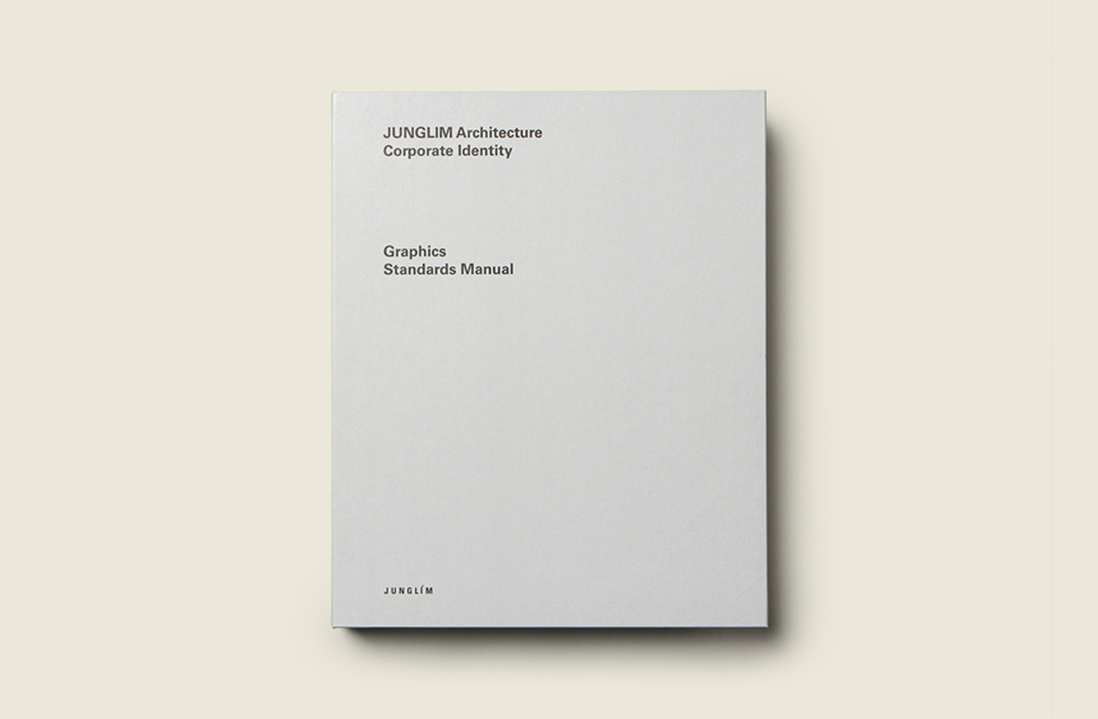

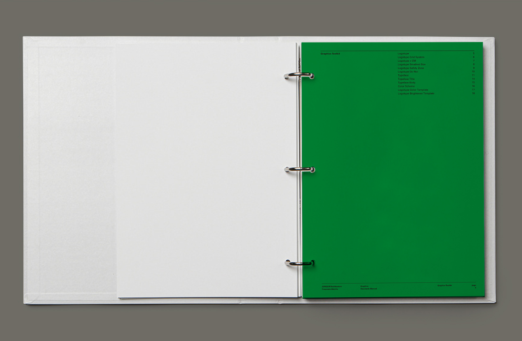



Junglim Architecture
Brand Design / Branding
2019
Client: Junglim Architecture
-
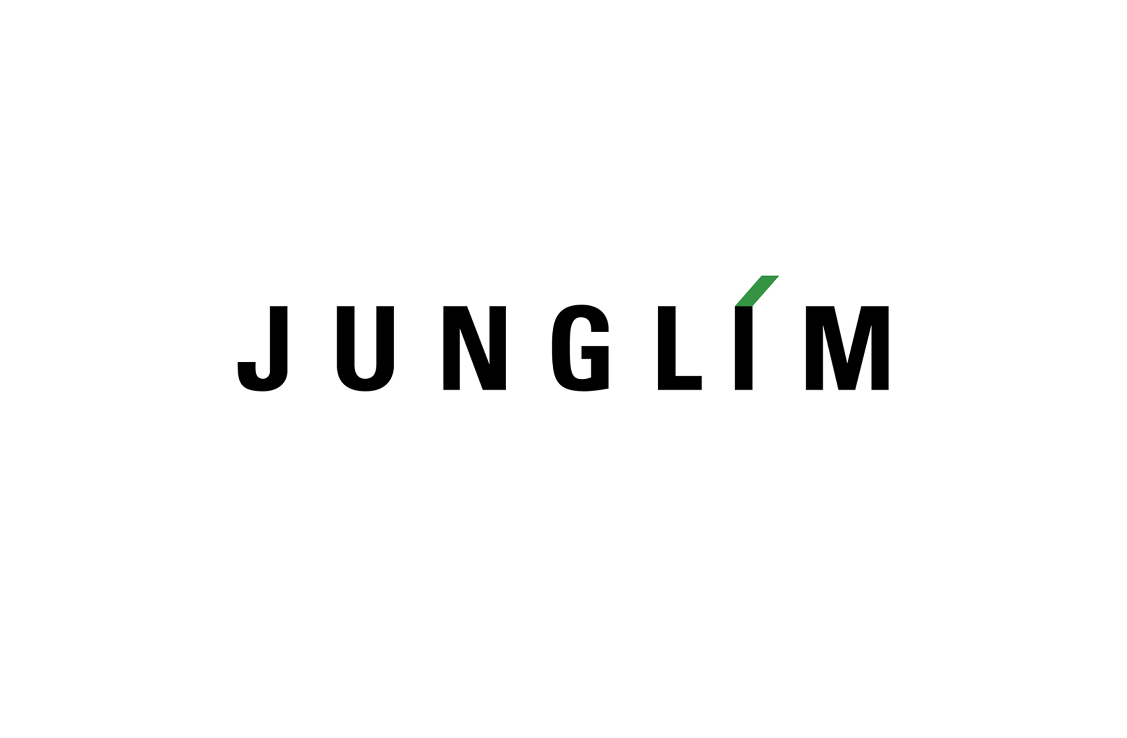
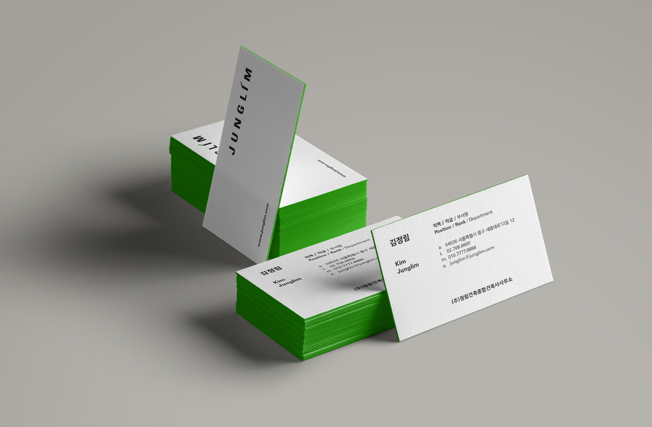
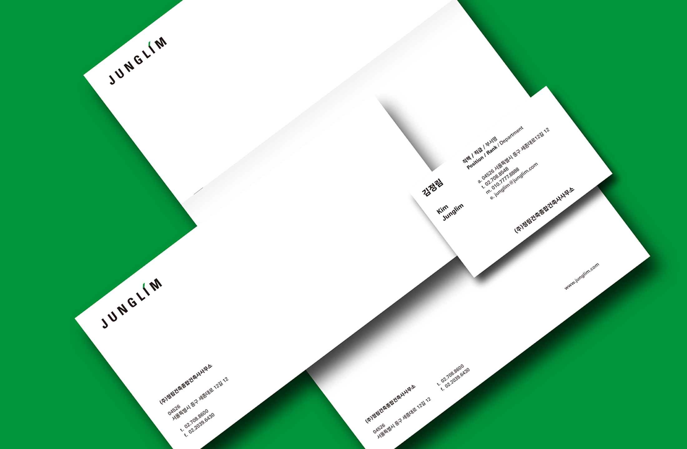
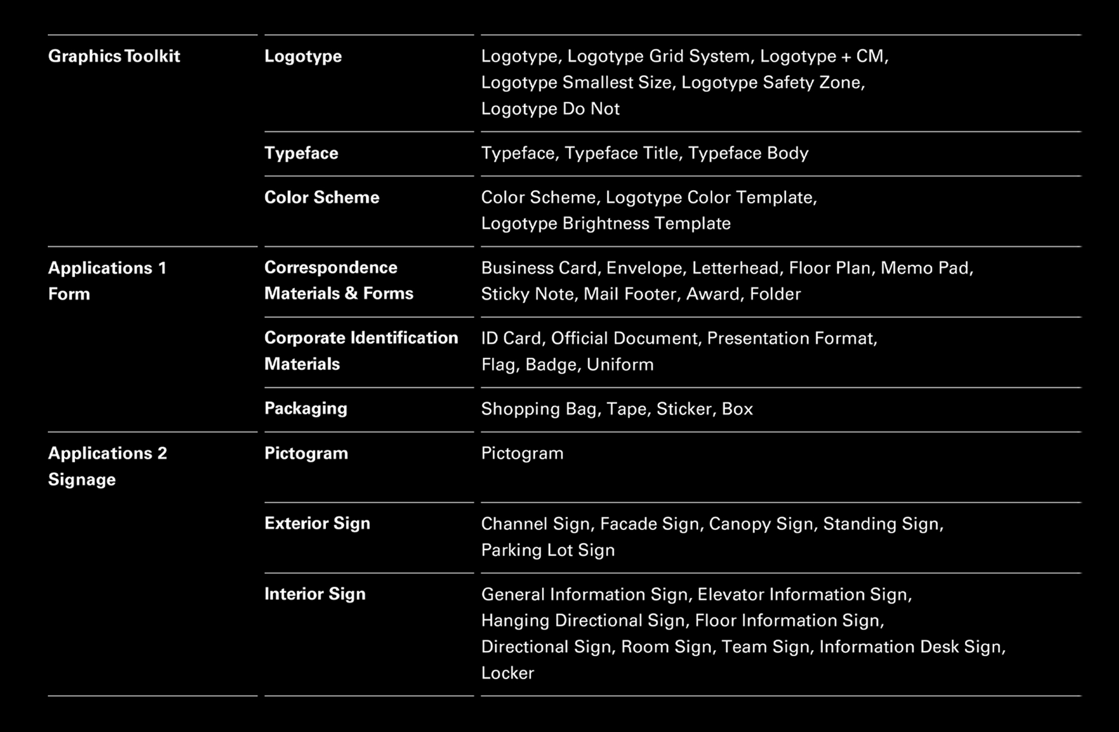
정림건축의 브랜딩 작업을 진행했습니다. 정림건축은 대한민국을 대표하는 종합건축회사입니다. 정림건축의 아이덴티티 시스템을 재정의 하는 작업을 진행했습니다. 단순하고 명확하며, 조화롭고 균형감 있는 규칙을 만드는 것이 핵심인 프로젝트였습니다. 기존의 로고타입을 바탕으로 더 정교하게 다듬어가는 과정을 통해 새로운 디자인 규칙을 만들 수 있게 되었습니다.
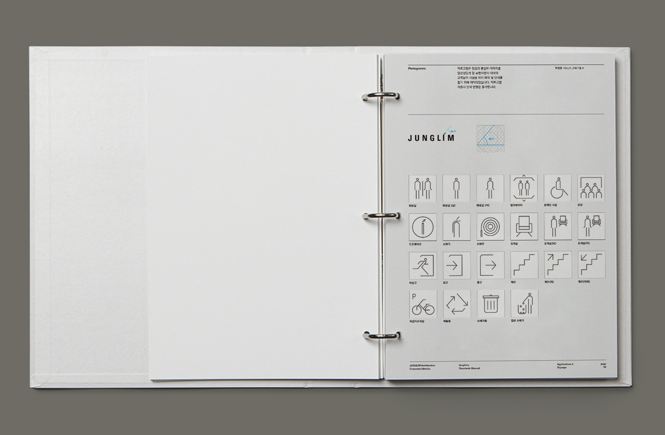
폭이 좁고 두께가 두꺼운 글꼴을 사용하고, 알파벳 대문자 ‘I’를 강조하여 최첨단 건축물을 설계하는 종합건축설계회사로서의 정림건축 이미지를 표현합니다. 이것은 정림건축이 조율해가는 인간의 행복한 삶의 공간을 시각적으로 형상화한 것으로 미래지향적이며 진취적인 모습을 상징적으로 보여 줍니다.
-
We proceeded with the branding work of JUNGLIM Architecture. JUNGLIM Architecture is a comprehensive architectural company representing Korea. We have worked on redefining the identity system of JUNGLIM Architecture. Creating simple, clear, harmonious and balanced rules was the key project. Based on the existing logo type, we were able to make new design rules through a more sophisticated process.
It uses a narrow and thick font and emphasizes the alphabet capital letter "I" to express the image of JUNGLIM Architecture as a comprehensive architectural design company that designs state-of-the-art buildings. This is a visual representation of the happy life space of humans coordinated by JUNGLIM Architecture and symbolizes the future-oriented and enterprising appearance.